
How does Colour Analysis Work?
I was talking to someone the other day and they commented on how many people don’t know their best colours. Dressing in our best colours means that we look happier and healthier as the light that reflects of our clothes complements our natural colouring.
Knowing how to dress in your best colours isn’t as simple as knowing if you are warm or cool. This article explains all the properties of colour and how they combine to make colour analysis works.

Colour Properties
There are five main properties of colour: Hue, Overtone, Undertone, Intensity and Value. Each of these is important in a colour analysis.
Hue
The hue of a colour refers to where it sits on the colour wheel. Primary hues are red, blue and yellow, secondary hues are green, violet and orange.
Overtone
The overtone of a colour can be warm or cool. Red, Yellow and Orange have a warm overtone. Green, Blue and Purple have cool overtone.
Undertone
The undertone of a colour refers to where the colour colour has been warmed up by adding yellow or red to the base hue, or whether it has been cooled down by adding blue. The most obvious example from the colour wheel is green. When we add more yellow to we get a yellow-green similar to fresh growth. When we add more blue we get a blue-green.

The colours on the left all have a cool undertone while the colours on the right have a warm undertone.
Intensity
The intensity of a colour refers to whether is is clear and bright or has been softened. The colours on the outside of the colour wheel are clear and bright.
Colour can be softened by adding white, grey, black, as shown on the colour wheel moving from the outside in. Colours can also be softened by adding brown, or by adding the opposite colour on the colour wheel, or by adding warmth (normally yellow) to a cool colour or blue to a warm colour (except for orange, which is always warm).
Value
The value of a colour is how light or dark it is. White has a value of 10 while black has a value of 0.
The value of a colour is determined by its hue and how it has been softened.
A clear Yellow has a lighter value than clear Green.

Colour Properties and Colour Analysis
A colour analysis considers the Undertone, Intensity and Value of your colouring to determine your Colour Palette.
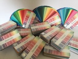
I use the Absolute Colour System, which has 18 colour palettes that vary in Undertone, Intensity and Value.
A colour analysis also covers how to put these colours together to look your best based on your overall Value as well as how much variety or contrast there is in your colouring.
Undertone and Intensity
Your undertone and intensity are determined by looking at the colours of your skin, hair and eyes.
As we age undertone tends to cool and our intensity tends to soften in our hair, skin and eyes, although if our hair turns white it may brighten again.
If you have coloured hair you should match the undertone of your skin and eyes, and be close to your natural intensity, although many people can brighten it a little.
Overall Value
Your overall value is normally determined by the value of your hair. Even short hair frames your face. If you wear a headscarf or hat, or darken or lighten your hair this will change your overall value.
Many babies have blonde hair which darkens as they age. Hair may darken a little if it goes through a ‘salt and pepper’ stage before lightening to grey and sometimes further to white. All of these change our overall value.
Value Contrast
Value contrast is the difference in value between the darkest and lightest parts of your portrait. This is normally between your skin and hair, but if your eyes or teeth are noticeably darker or lighter than the rest of your face, then these can affect your value contrast too.
As we age and our hair greys, or if we colour our hair or wear a larger hat our value contrast can change.
Colour Contrast
Colour contrast has to do with how many hues you have naturally in your portrait area. You may have coloured or neutral skin, hair and eyes.
If your hair, skin and eyes are all neutral, you are low colour contrast and will look best in all neutrals or in neutrals plus one hue.
If you have one colour in your hair, skin and eyes you will look best in wearing neutral colours + one hue or wearing colours that are beside each other on the colour wheel.
If you have two different hues in your hair, skin and eyes, you can wear neutrals plus two colours and will always look best when wearing a colour. When wearing two colours, you should match the difference apart that the hues are on the colour wheel with the hues in your clothing. Blue and orange are opposite on the colour wheel, so you should wear other opposite hues such as green and red. If you have blue eyes and yellow hair, you can wear blue and red, or green and violet.
If you have three different hues in your hair, skin and eyes, you can wear all colours without any neutrals.
If you change the colour of your hair, wear coloured contacts, or even wear a scarf or hat it can change your apparent colour contrast.

Low Colour and Low Value Contrast
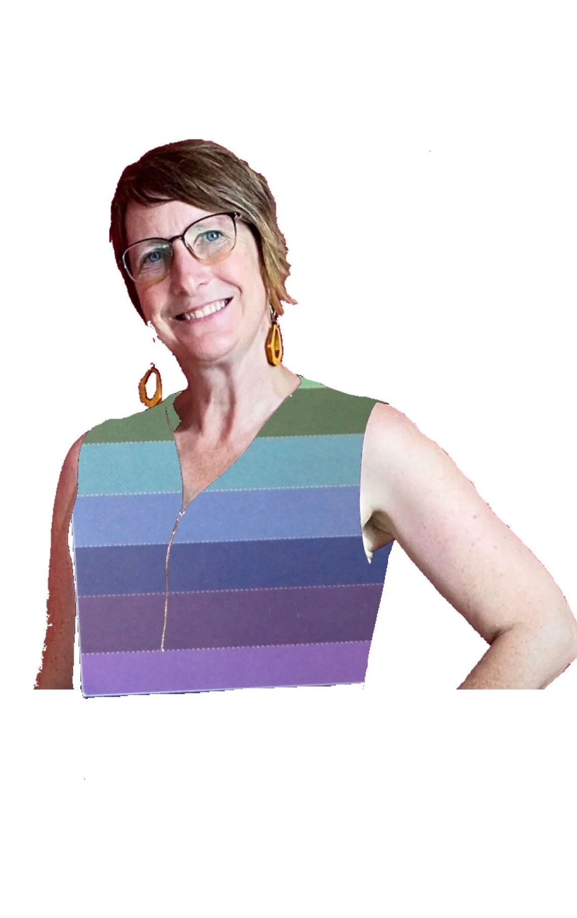
The pink and purple are next to each other on the colour wheel, so this combination is low colour contrast. The colours are all of a similar value, in this case light, so this combination is low value contrast.

High Colour Low Value Contrast
Purple and yellow are opposite on the colour wheel, so this is high colour contrast. The colours are a little darker than in the previous image, but are all still on the light side, so this combination is low value contrast.
Colour Analysis for Clothes
One of the reasons to get a colour analysis is to match your clothes to your natural colours. A lot of people worry that they won’t be able to wear a particular hue once they have their colour analysis done. However, with the exception of orange (warm only), black (cool only) and pure white (cool only), there are varieties of all hues in all the palettes.

In the picture on the left I am wearing warm colours and in the right cool colours. The left hand side goes better with my natural colouring, which makes my eyes pop and my skin glows, while the colours on the right look a bit dull on me. You can also see how there are shades of the same colours in both palettes.
For example, while blue has a cool overtone, there are blues with both warm and cool undertones so everyone has blue in their palette.

Cool palettes have warm and cool blues as blue has a cool overtone.

Warm palettes only have warm blues.
Looking the best in your Colours involves getting the Undertone, Intensity and Value of your colours right as well as dressing for your Value and Colour Contrast.
I like to think of each outfit as having a colour score out of 5. Hitting 5 out of 5 each time, can be tiring and unrealistic.
Most people look good getting 4/5 elements of colour right and there are times when 3/5 is appropriate, like when you are overall light but want to wear a darker outfit as it projects authority.
While 4/5 is a good long term target to aim, if your wardrobe isn’t in your palette, focusing on getting your colour and value contrasts right with your existing clothes can improve your image while working with your existing wardrobe.
Colour Analysis and You
Our colours also change over time. While the most familiar sign of ageing is grey hair, our skin and eye colours change too. The baby with blue eyes and blonde hair ends up can end up with brown hair and eyes. What once looked amazing on us, can know make us look old and tired. For this reason it is recommended that we review our colours every 5 or so years.
I you are wearing the same colours you were wearing 5 years ago it might be time for a quick review.
If you would like to find out more, check out the rest of the 101 series, book a free discovery call, or find out more about what’s involved in a colour analysis.
All photography copyright WearAble Wardrobes